A while back I wrote a post called Who Is Your Website For?. A common mistake made by new web owners is they design their site for themselves rather than for their audience. The same could be said about other aspects of a business. Each day we use multiple methods to reach people and generate new clients, among these methods are emails, books, workshops, business cards, flyers, postcards and online classes. Being a part of the whole creative process opens us up to criticism from everyone involved. After all, opinions are like potato chips, you can’t have just one.
Those of us devoted to quality spend hours perfecting our chosen products. It’s easy to get emotionally attached and believe we’re beyond any criticism at all, so when some well-intentioned advice rolls our way, we’re crushed to think our work isn’t appreciated. We may even get angry and lash out with, “What are they talking about? This is perfect!”
The truth is, there is no such thing as perfect. And…not everyone will see the same things in the same way you do.
When I work on a project, whether it’s for a client or ourselves, Wendi is definitely the voice for the audience before it hits public viewing. Wendi will be the first to tell you she’s no techie. She’s also dyslexic (though you’d never know it from all the novels we’ve written together). Wendi is also an accomplished artist in her own right with a keen eye for color and composition, and she has an uncanny knack for finding exactly the right stock photography we use in creating composite images for our cover designs.
The fact that Wendi lacks technical understanding keeps me from getting too complicated while writing “how to” posts. When I write, I ask myself, “Will Wendi be able to follow this?” Sometimes it works, sometimes it doesn’t, but I know that it’s nothing personal when she tells me she didn’t understand one word of it. These last looks before a post goes live also tells me when my message is unclear or when I’ve gone on a tangent.
I was also blessed with perfect eyesight (well, until I needed readers) and I’m not dyslexic. I have two hi-res monitors to help with the professional aspect of my work. I have more fonts than Imelda Marcos had shoes. When I use those fun fonts, I already know what they’re supposed to say. Sure, it all looks beautiful to me, but for someone else? Maybe not so much—especially to someone who sees words in a jumbled mess to begin with.
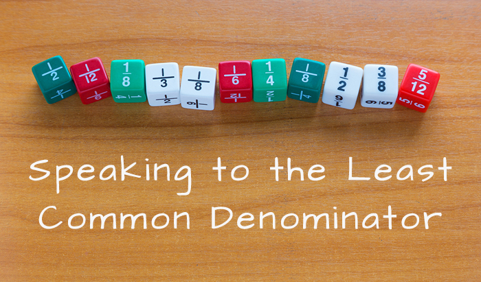
Composing a book cover, an interior, a website or an email mailing requires I look to the least common denominator—the person who is dyslexic, the older members who read our books and need a little more spacing between the lines or a slightly larger font, even if it does increase our already massive page count. Exchanging what may be a busy background for a more subdued one, or making a minute color adjustment, helps clarify the overall message to someone who may be easily distracted from the noise.
True, there are folks out there who pick for the sake of picking. They’re never happy with anything anyone does, and I’d go so far as to say this stems from their own insecurities, so they make themselves feel better by offering useless criticism, meant to harm rather than help.
But there are other folks who do want to help. They may be the one voice in ten who points out a flaw.
There are times I’ve been working on a project that’s had 20 revisions already and spent so many hours on it I’ve lost count, I have a knee jerk reaction like I described above. How dare they tell me how to do my job! Who’s the expert here anyway?
But…I’ve learned to take a step back and think, okay, maybe there’s something to it. Maybe there are others who won’t speak up. Maybe what I have here could be a touch better?
As difficult as it may be at times, try not to take this kind of feedback personally. Communicating in text (instant messages, emails, etc.) is difficult. The tone we perceive may not be the one intended. Not everyone is a wordsmith and they may not realize how they “sound”. Objectively look at the suggestions or offer solutions. Is a reader having trouble seeing the text on your website? If you’ve already got your text set to 14pt and it’s as big as you’d like to go, suggest they change the size of their text setting in their browser. If your text is on the small side (10 to 12pt), then yes, you could stand to bump it up a bit.
When you’re publishing books, consider the age of your audience. I’m always amazed when I look at trade paperbacks I read back in the 70s and 80s. That text was tiny! How on earth did I ever read all that and not walk away with a raging headache?
Details do matter and it has nothing to do with being a perfectionist. Knowing your audience and your clientele tells you exactly what details you should be paying attention to. Listening to what your audience has to say goes a long way in making that audience stay with you and gaining new readers or clients.
Take what’s useful and let the rest go. You can’t please everyone, but you can try to please the specific people you’re talking to. Figure out who that least common denominator is and speak to them. Chances are, when you do, everyone will have a much better experience.


Leave a Reply