NaNoWriMo (National Novel Writing Month) is coming to an end. By now, thousands of writers are deep into their personal novel writing marathons with visions of bestsellers dancing in their heads. Come December, editors, agents, and Amazon will be flooded with a tsunami of new books. Some of these writers will realize they’ve only written a first draft and will take the time to polish their stories before pounding the pavement with marketing and PR. They’ll gather their professional team of editors and designers and invest as much in the final product as they did with their task of writing the book to begin with.
Others…not so much.
They’ll convert the raw story from a word.doc into a PDF, slap a homemade cover on it and call it a day. Sad but true.
Today, we’re going to talk about some of the common mistakes new authors make when they attempt to DIY a book cover. The results, more often than not, are tragic. In a world where we hear “Never judge a book by its cover”, the harsh truth is, we do judge books by their covers. Chances are, if the cover is a mess, the potential reader can only imagine what lurks between.
Your cover is your front-line first impression. You have three seconds or less to entice a reader into buying your book. You have to stand out from the thousands of other books out there on the market. If you don’t have the skills or the tools to do it correctly, do not attempt this at home!
But…if you are bound and determined to do so, here are a few common mistakes people make when attempting a cover design.
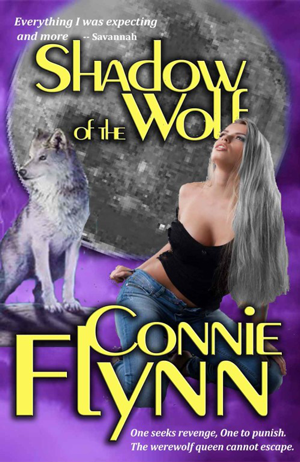
The Cut and Paste
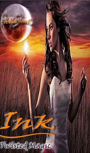
Remember back in the day before special effects in movies looked cheap and cheesy, and you could see the hard edge between the actors and the background green screen? Nothing was as seamless as it is today, were computer generated images lived and breathed in their own space.
That’s what this example of “cut and paste” is like. Making a collage of several different images into one with Photoshop is an advanced skill that takes a lot of practice. You have to have hi-res images and know exactly how to mask those edges so they occupy the same space. You have to know a bit about lighting and tone.
In this image, the moon was obviously taken from a much smaller image and enlarged to fit. See how the edges are all ragged and pixelated? That’s what happens when you try making a digital image bigger than it’s supposed to be.
The wolf and the woman don’t go together either. The wolf is a painting, the woman is a photo. It’s easy to see that neither of them are “living” in the same space. They’re not believable at all. Both have very hard edges around the outside where they were “masked” (the technique of isolating a subject from its background).
The light source is at least coming from the same direction (upper left, making the shadows come out to the lower right), but the light’s tone is worlds apart. And I would go so far as to say that the creator of this cover didn’t get any permission to use that illustrated wolf either. Nothing here matches, it’s all one big distraction.
The only positive I will say is the font. It’s bold and simple and would stand up as legible when the overall cover image is shrunk down.
All the tiny sub-text would have to go. It’s too small and will get lost on a reduced thumbnail image required for sale on the many ebook distributor sites.

Refrigerator Art
Do you remember when you were a kid and your mom would pin your artwork to the refrigerator with magnets? Yeah, it’s kinda like that. Every now and then you come across a cover where the DIY’er fancies themself an illustrator, or has a friend who does…or a child…or cousin…or whatever…and they think it’s a good idea to illustrate their own cover.
Unless your illustration skills, or those of your family and friends, can stand up to the Michael Wheelans and Lindsay Looks of the world, don’t do it.
Bite the bullet and hire an illustrator.
What makes this worse is the mishmash of a poorly drawn image with a photographic background. The photographed background only makes the poor quality of the image stand out even more.
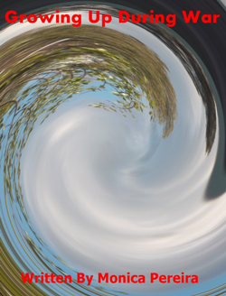
All About the Image
Lately I’ve been seeing a trend where the cover image overpowers the text. People seem so enamored with their cover image that they don’t place the text properly. They’ll shove the title as far up to the top as possible and put their by-line (the author’s name) crunched way down at the bottom.
Make use of your “white space”. Look at the image and seek out the empty spaces where text would go and read the best.
Whether a designer or illustrator chooses an image for a cover, they keep the white space in mind. An illustrator will purposely keep large areas open for text, and a designer would search out photographs that do the same.
Aside from poor text placement, this cover has several other problems. First, it tells us nothing about the book. Every cover tells the story of the story inside. What does this warped, swirly thing mean? It doesn’t say anything about a war. What war is the author talking about here? Is it an actual war? Is it an internal, personal war?
Red text very rarely works. It’s jangly on the eyes and doesn’t show up well. Another mark of an amateur is using “by” or “written by” in the by-line. Just use the author’s name. Stay away from using qualifiers, they’re not needed.
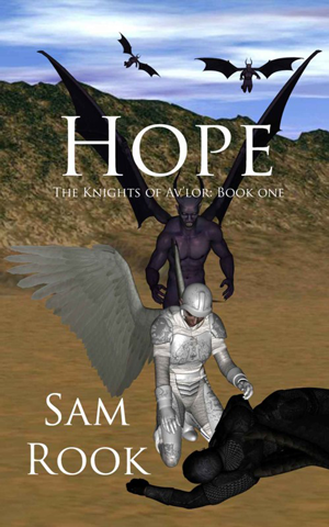
The Video Gamer
Many new novelists come from the gaming ranks; video games, role playing games, online creative writing boards. They start out gaming with a favorite character they’ve created and decide it would make a great novel.
Going from gamer to novelist has many pros and cons, as does creating a cover from these games. Video game art and design has come a long, long way over the years, and some of it is downright stunning.
But taking screen shots from your favorite game and sticking them on your cover is not. The images come out stilted and robotic. And on top of that, you run the risk of copyright infringement.
Yes, some other designer created those figures for a game and that game holds the copyrights on the images.
On the other hand, maybe this person is a 3D enthusiast? That’s fine…if you know what you’re doing with 3D rendering. I’ve seen some fantastic 3D images and doing this kind of work takes as much skill as any illustrator to make the final images photo-realistic and believable.
What we have here comes off flat and lifeless. None of the figures occupy the space they’re in. Where are the shadows on the ground? In fact, where’s all the detail in the ground itself? Everything is flat and pasted with that hard edge we saw in our first cover example.
This cover would never stand up as a thumbnail. The image would become mud and that sub-title would deteriorate into nothing.

Symbolism Overload
Symbolism is important on a cover. You want enough of it to give the reader a taste of what’s inside. But adding symbolism is just like showing and not telling with your story content, and there’s a very fine line between too much and not enough.
Some covers, like this one, become a kitchen sink of symbolism—far too much of it and none of it telling us a thing about the story.
We have a sexy torso that hints at romance, as do the pink pumps. We have wolf eyes suggesting a possible shifter tale, a raven and a mic stand.
What does it all mean? On the surface, it tells me nothing. What does “She” know? Who are the Valkyries soaring with the ravens? Who is this guy? Are we talking about a wolf in pink pumps singing karaoke in a smoky nightclub?
My brain hurts with the infinite possibilities of what this book may be about.
Then, way, way at the bottom, hiding in the tiny text is the author’s name.
Shrunk down for a thumbnail, all we would see is the word “Infinity” and a mashup of images that don’t make sense.
When using symbolism, pick one or two clear images that SAY something about the story. Those images should offer a bit of mystery that draws the reader in, and not confusing that drives them away because they had to think too hard to figure it out.
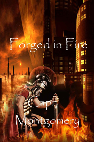
Poor Font Choices
In the wonderful world of fonts, there are always a few that get over used, and used in the wrong way. This cover, with its Papyrus font is one of them.
This font is far too frail to hold up. It comes off spindly and broken against the busy background. The spacing between the “F” in Forged and Fire is too far away from the rest of the word. The author’s name is totally lost.
This cover also suffers from the image being more important than the text like we talked about above in All About the Image. Look at the top half of the image. See all that open space? This cover would benefit from the title being moved up into that area, with a stronger font. The author’s name would read better right under the book’s title.
With that done, the kneeling figure could be made larger and less transparent in the bottom half of the image.
Little fixes like that would go a long way to improving this cover. They may not solve all the problems, but they’d be a good start.

The Busy Background
Every so often, when clients send us images they’d like to use as a cover, they send us lovely images, but the images are so busy, no matter what we do, the text is unreadable over the top of it.
That’s when the designer has to come up with some creative solutions.
Here we have a cover with one of those backgrounds. For this kind of image, it’s always best to stick with simple fonts. Decorative fonts won’t read well over all those leaves and branches. This designer seemed to be aware of that and tried putting a transparent block of color to bring out the title and sub-title.
It may have worked if he/she didn’t use a fancy font like this. The drop shadow added to both the title and sub-title didn’t help much either. All of it still gets lost.
The only choice here is to use a different kind of treatment on the image (like using blocks of solid color top and bottom the same as they did for the author’s name), or better yet, getting rid of that background image altogether.
The trees don’t tell me what the story’s about. Is it a walk in the woods? Is this Logan Hammersmith a lumberjack? Is this a fantasy novel? Is it a memoir? Are Ewoks involved? Your guess is as good as mine.
Squished
Doing a cover on their own isn’t the only way DIY authors cut corners. They’ll find a small image on the web and try to make it fit a cover.
Getting an image with the right resolution is important. We touched on that with the moon in Cut and Paste. Too small and the image gets pixelated and blurry. The wrong dimensions, and your image won’t scale proportionately.
What is scaling proportionately? This image here was probably a landscape (or horizontal) image. A rectangle that was wider than it was tall. The designer here tried taking that wide image and putting it into a tall, narrow space, therefor distorting the whole thing.
Covers have a portrait (vertical) orientation. The sides are longer than the tops and bottoms. When searching for images, you want to keep this in mind and find other images with a similar orientation. This way when you shrink them down or enlarge them, they’ll fit better.
If you can’t find images that match the orientation you have, then you have to look at the image and figure out how much of that will be cropped (cut out) when you try fitting it into the space you have.
Still Want to Make Your Own Cover?
These are just a few examples of covers gone wrong. Building a great cover takes knowledge of composition, typography, color and skill with programs such as Photoshop, Illustrator, and in some cases, 3D Max.
But this is only the beginning. Next week we’ll talk about what happens between the covers (oooh, sounds sexy!) and a few common mistakes DIY authors make when formatting their books.
Are you suffering from a bad cover design or overwhelm at the thought of making your own cover? Contact us, we’ll help you out and create a cover that won’t end up on the Covers Gone Bad list!
Special thanks to Lousy Book Covers. Visit this site for more book cover disasters.


I will never look at a book cover the same way again! Thanks to you, I now know how much I don’t know about what makes great cover art and why it is called art at all.
Good! Now you know a little bit more than you did before
Great advice and thanks for the examples. Book covers are truly the first impression and your points are spot on.
They really are the first line for getting readers to buy your book. Now more than ever, book covers really need to stand out…and not in a bad way!
Who knew there were so many things to consider when creating a book cover? Great tips, and I’ll never look at a book cover the same way again.
Oh Elizabeth, this is just the tip of the iceberg. But, if you can learn from these mistakes, they’ll definitely help. And really, book covers aren’t that much different than websites. I’ve seen a lot of these kinds of mistakes done on sites too.
Oh wow. Those are very well chosen examples of what not to do and how much more attention I need to put into anything I publish!! Thank you for breaking it down into basic things to look for and pointing out the price of not doing it. Yikes!
Aly, if you want to see a ton more, check out the Lousy Book Covers link at the end of the post. I spent an hour on there one night finding one good bad example after the next! I had to make myself stop before I had a whole book written here. And that may not be such a bad idea.
Great post! In addition to all the great tips on what NOT to do when designing my own DYI novel cover, this post made me laugh aloud. In my bookstore experiences it seems that the number of novels involving wolves, wolf-like beings and straight out werewolves is oddly over proportionally represented in the book-covers-gone-terribly-wrong section, so it was particularly entertaining to see your examples.
And these two lines seemed so familiar to the me, they brought tears of laughter to my eyes:
“Are we talking about a wolf in pink pumps singing karaoke in a smoky nightclub?
My brain hurts with the infinite possibilities of what this book may be about.”
I REALLY want to know what Savannah was expecting!
Great post Deb. I’m a firm believer in do what you do well and hire others to do the rest!
I’m with you! I wouldn’t take a graphic step without my graphic artist. I’m so glad I found him and he gives a unified look to all my stuff. And I agree with Jennifer; I wouldn’t know what to do without my web master either. Blogs and copy changes . . . I can write them and my assistant can post them. Frees up your time for what YOU do best.